button Block
Overview

Gutenberg Button Settings
The following settings are available when using Gutenberg buttons:
- Alignment: Left, Center, Right
- Bold
- Italic
- Strikethrough
- Link
- Font Color
- Background Color
- Additional CSS Class
Let’s take a look at how to customize a button block’s style & settings.
Button Text & URL
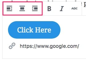
Your button’s text & URL can be customized right within the editor. Just type your text within the button, and include your URL next to the chain link icon directly below the button.
Bold, italic & strikethrough styles are also available for selected text within the button.
Button Alignment
You also have the option to float the button to the left or right (wrapping text around it), or center it on the screen. Just click the appropriate alignment option found directly above the button.

Button Colors
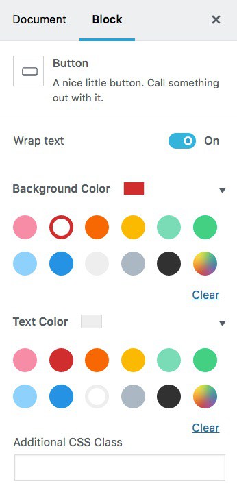
The button colors are updated in the advanced settings panel (found in the right sidebar). You have two options:
- Background color
- Text color
Choose from a preexisting color that has been chosen by your theme, or click the multi-colored circle to choose a custom color.
Reminder: In order to stay on brand and show a consistent design, I recommend sticking to the same one or two styles for all of your buttons.

